Saturday, 18 June 2016

Excel Level-Up: Day 10

Chart Template

Are you happy with the new look of your graph from yesterday? It could be troublesome to apply the same steps for each graph…

What if I tell you that you can save the nice chart as a template? And you can apply that template to all your future graphs?

Does that sound like a good idea?

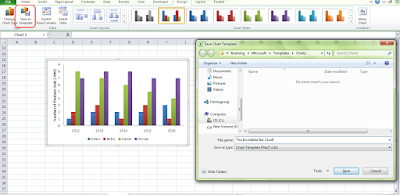
Now, select your nicely formatted graph. Go to “Design” under the “Chart Tools” ribbon.  Click “Save as Template”. Save it as “The Incredible Bar Chart” (just kidding!).


Now you have the nicely formatted template in your pocket. 


Let’s say you have just plotted another bar chart. Select the graph. Click “Change Chart Type” under the same ribbon, click “Template”. Select “The Incredible Bar Chart”. OK.


 You graph has just been leveled-up within 2 seconds.

And with that, thank you for staying with us for these 10 days. We sincerely hope you learnt something useful in Excel. Leave us comment and let us know if you want to learn anything else in details! Share with your friends if you find these useful.

Go back to previous awesome trick: Excel Level-Up: Day 9
Friday, 17 June 2016

Excel Level-Up: Day 9

No more default graph

Does your chart always look like this?


While it is quick and easy to produce, it shows you as an Excel amateur too. Worse, this graph tells us that you are too lazy to bother about formatting it into a nicer/tidier chart.

As people judge you from your graphs (we all know they should not, but in reality, they do!), it is worth spending some time upgrading our graphs. 

In the minimum, please,
Step 1: Remove grideline
Step 2: Move your legend to the bottom, to maximize the graph area
Step 3: Label your axis
Step 4: Remove tick marks on the axis
Step 5: Change the texture of your graph and the colour of the fonts.


How do you feel about your graph now?

Go back to previous awesome trick: Excel Level-Up: Day 8
Proceed to next awesome trick: Excel Level-Up: Day 10

Thursday, 16 June 2016

Excel Level-Up: Day 8

Plotting Graph

Are you being traumatized from your past graph plotting experience?

Today, we are going to show you an error-proof graph plotting trick. It is a very simple trick that rectifies mistakes that most of us do when plotting graph.

Do you always construct your table in this way when you plot your graph? 
If so, you are most likely to have to adjust for the axis label and will have to remove the “Year” column manually.


Here is our trick, in order for the graph to pop out nicely, REMEMBER, to let the left-upmost cell to be EMPTY. So, if you just clear that cell and re-plot your graph, it will fall out just nicely.


It is as simple as that.


Go back to previous awesome trick: Excel Level-Up: Day 7
Proceed to next awesome trick: Excel Level-Up: Day 9

Wednesday, 15 June 2016

Excel Level-Up: Day 7

Conditional Formatting

This is a very useful trick if you have to analyze huge bunch of numbers all the time. Imagine you have a very big table and you are trying to figure out the trend or trying to find the largest number. The quickest and most intuitional way of doing this is by using conditional formatting.
It is an in-built function in Excel that allows you capturing any trend/pattern in the data within seconds. 

Now, go to “Home” ribbon, and click on “Conditional Formatting”. Then, go to “Colour Scales” and choose your favourite colour scales to apply on the data.


As our intention is to introduce you “Conditional Formatting”, we will leave you to explore on other potential usage of this amazing function. As you can see, there are still plenty of options that can be chosen from. 

I assure you that each of them is very helpful and worth your time exploring.

Go back to previous awesome trick: Excel Level-Up: Day 6
Proceed to next awesome trick: Excel Level-Up: Day 8


Tuesday, 14 June 2016

Excel Level-Up: Day 6

Evaluating Formula

How do you understand a super long formula like this?

=IF(OR($R150="",W$148=""),"",IF(2016+$P$150-W$148>$P$159,"",MAX(IF(COUNT($S$148:W$148)=COUNT($S$148:$AB$148),OFFSET($X$99:$X$108,($P$159-COUNT($S$148:W$148)),0,1,1),IF((1-OFFSET($AF$149:$AF$158,($P$159-$P$150-COUNT($S$148:W$148)+1),0,1,1))=0,IF((OFFSET($X$99:$X$108,($P$159-$P$150-COUNT($S$148:W$148)+1),0,1,1))=0,0,IF($P$150>1,0,OFFSET($X$99:$X$108,($P$159-$P$150-COUNT($S$148:W$148)+1),0,1,1))),IF($R150-W$148=$P$159,IF(OFFSET($AF$149:$AF$158,($P$159-COUNT($S$148:W$148)),0,1,1)=1,0,(1-OFFSET($AF$149:$AF$158,0,0,1,1))/(1-OFFSET($AF$149:$AF$158,($P$159-COUNT($S$148:W$148)),0,1,1))*OFFSET($X$99:$X$108,($P$159-COUNT($S$148:W$148)),0,1,1)),IF((OFFSET($AF$149:$AF$158,($P$159-COUNT($S$148:W$148)),0,1,1))=1,0,(OFFSET($AF$149:$AF$158,($P$159-$P$150-COUNT($S$148:W$148)),0,1,1)-OFFSET($AF$149:$AF$158,($P$159-$P$150-COUNT($S$148:W$148)+1),0,1,1))/(1-OFFSET($AF$149:$AF$158,($P$159-COUNT($S$148:W$148)),0,1,1))*OFFSET($X$99:$X$108,($P$159-COUNT($S$148:W$148)),0,1,1))))),0)))

Luckily, Excel understands your difficulty and so has built-in an awesome tool called “Evaluate Formula”.

Go to “Formula” tab in the ribbon, “Evaluate Formula” is in the Formula Auditing section.


This function helps you breaking down the long formula into smaller digestible bits. Each time, you click the “Evaluate” button, it will solve the next small part of the formula.


No freak out anymore when you see complicated formula in the future.


Go back to previous awesome trick: Excel Level-Up: Day 5
Proceed to next awesome trick: Excel Level-Up: Day 7